This is a companion piece to Part 1: Assessing and improving Arsenal Women’s attacking corners using data.
To see all the code used (and try it out), see the GitHub repo.
While this piece was triggered by what I saw at the Brighton game last week, I've been wanting to do some longitudinal analysis on Arsenal’s season, particularly right now when we haven't had the greatest of starts to the season. But hey, that means there’s more opportunity to make gains.
The answer to "why are we losing games" can be very broad, and for a piece like this, fixing everything isn't the point. At Richmond Hockey Club, where I am the Men’s 1st Team Performance Analyst, I've learnt that focusing on a small section of the game, finding something actionable and evidencing it well is much better than broad brush strokes, and it gives me the foundation to build the team’s trust in the numbers.
For corners, which is a particularly self-contained and repeatable part of the game, I went about it as follows:
- Defining and identifying roles
- Defining pitch geography and recording player locations (as a substitute for tracking data)
- Spotting existing patterns (i.e. clustering)
- Critically assessing good and bad patterns / actions, and
- Finding gains
Data collection, tracking data and knowing what is really needed
Sadly I don't have access to tracking data, but I do have access to broadcast video (on YouTube). This means that I inevitably have to do all the data collection myself. This isn't the worst thing in the world, as I get the opportunity to also watch the videos and process them in my head, but I needed to be strategic about what I collected so I didn't bore myself to death.
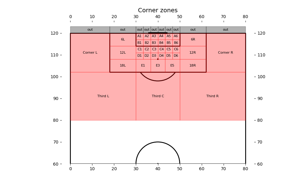
I used the following corner zones, and for each corner, I recorded the start and end positions of each player during the corner, as defined by the following:
- Start position: Right before the corner taker begins her run-up. My hypothesis (which was confirmed after watching a few clips) was that the players don't tend to have multiple phases of movement, in what would be known as a pre-snap motion in American football (e.g. drifting for 10 metres before changing direction to make their final run). Therefore this definition is fine.
- End position: When the ball arrives at the target area. This is usually quite clear cut (e.g. about to land on the attacker’s head), but some judgement is needed for deliveries that clearly didn't go to where they were supposed to go, because players will check their runs when they see that happening. Since the purpose is to capture the intent of the play, picking a slightly earlier point in time usually provides enough information as to where the player was aiming for.
A play quality metric indicates how likely we would score if the delivery was successful
So much of the success of a corner depends on the delivery, and as fans that is naturally where our focus lies. As coaches and analysts, however, we need a way to measure and reward the process goals as well as the outcome. Here I define a play quality metric that aims to measure
- How well was the play designed?
- How well did each player execute their role?
For every player, the metric is the probability of them being able to take a shot on goal. If there was no one around them and the delivery was perfect, this would be 1. This is tempered by their role and how they are marked. Where more detailed data is available, this could also include a physical metric (e.g. HOPS or velocity), but I don't have that right now.
Each player is assigned a role, based on what I could infer from their movement in the video. Each player is also assigned a marking score, which is how tightly they were marked at the end of their movement. The scores are multiplied to give the player’s score, and the sum of the scores is the score for that corner.
| Role | Description | Value |
|---|---|---|
| Shot target | A first receiver that is intended to take a shot | 1 |
| Pass target | A first receiver that is intended to pass the ball (e.g. flick on, head back across goal) | 0.5 |
| Second target | A second receiver that is intended to take a shot | 0.2 |
| Blocker | A player who is deliberately blocking an opponent from reaching an area. Relatively low because they aren't intending to score, but the value of a good blocker would be reflected elsewhere in the scoring. | 0.1 |
| Decoy | A player who isn't aiming to win the ball, only to occupy a defender | 0.1 |
| Mop up | A player who is waiting for a breakaway or loose ball away from the congested areas | 0.05 |
| Marking | Description | Value |
|---|---|---|
| Free | In space with no obvious marker | 1 |
| Freed by blocker | In space because the marker has been blocked by a teammate | 1 |
| Blocking | Is blocking and is in front of the marker relative to the space being denied. Can be blocking multiple people. | 1 (because only blockers can be blocking and there is no point penalising them further) |
| Gained separation | Has got in front of their marker relative to the ball or pulled away from their marker | 0.8 |
| Watched zonally | Is being covered by a zonal defender | 0.5 |
| Goal marked | Marked on the goal side | 0.3 |
| Front marked | Is behind the marker relative to the ball | 0.1 |
There are some caveats:
- Since I am using broadcast data, players that are out of shot won't have any data collected on them. This unfortunately means that some corners had incomplete data (sometimes severely so), and they had to be discarded. In a club setting, analysts will have tactical cameras which should solve this issue.
- This metric is currently a subjective metric, in the sense that it requires a human to categorise each player’s actions. For roles, those in the know (i.e. Arsenal staff) can directly map this to their plan, but those not in the know (e.g. opposition analysts) will just have to guess. For the marking type, one can imagine a world where highly detailed computer vision (e.g. using pose estimation) and tracking data might be able to automate this, but that’s still a big "might", and it probably isn't quite here yet.
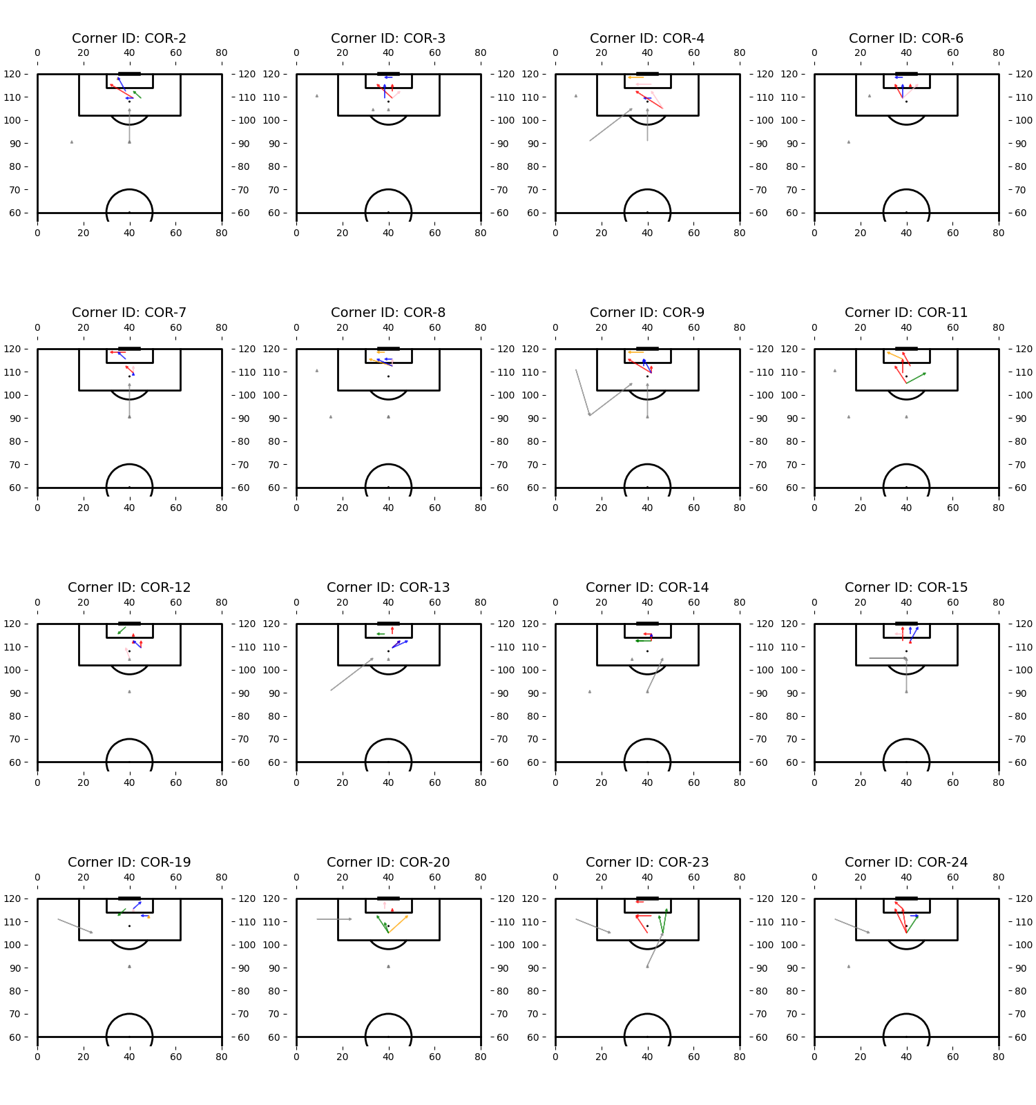
Does this metric work in practice? To see for yourself, here are two corners, one got a very high score (2.945) and the other got a very low score (0.625). Ask yourself – if the delivery was perfect, how likely would Arsenal have scored?

(If you read Part 1, I might have given it away…)
Plotting play diagrams
With all the positions and roles collected, I could then plot play diagrams for each corner, which helps greatly with understanding what goes on without watching video every time:
Clustering similar plays to form groups that I could analyse
The bulk of the work went into this section. In theory, since the data is relatively uncomplicated (a categorical role, and some X-Y coordinates), it shouldn't be difficult to use well-established clustering techniques to find however many set plays that Arsenal tend to deploy. Of course, the reality isn't that simple.
K-means
Feeding the data directly into a clustering algorithm (I started with k-means) is sound in principle, but is complicated by the fact that any number of players can be involved in a corner, and they can take any combination of roles, with duplicates and gaps allowed. I used various methods to try to get around this, from only including a fixed number of players at a corner (5), to one-hot encoding of roles (which struggled to learn across players playing the same role but in a different player slot), to aggregating roles before fitting.
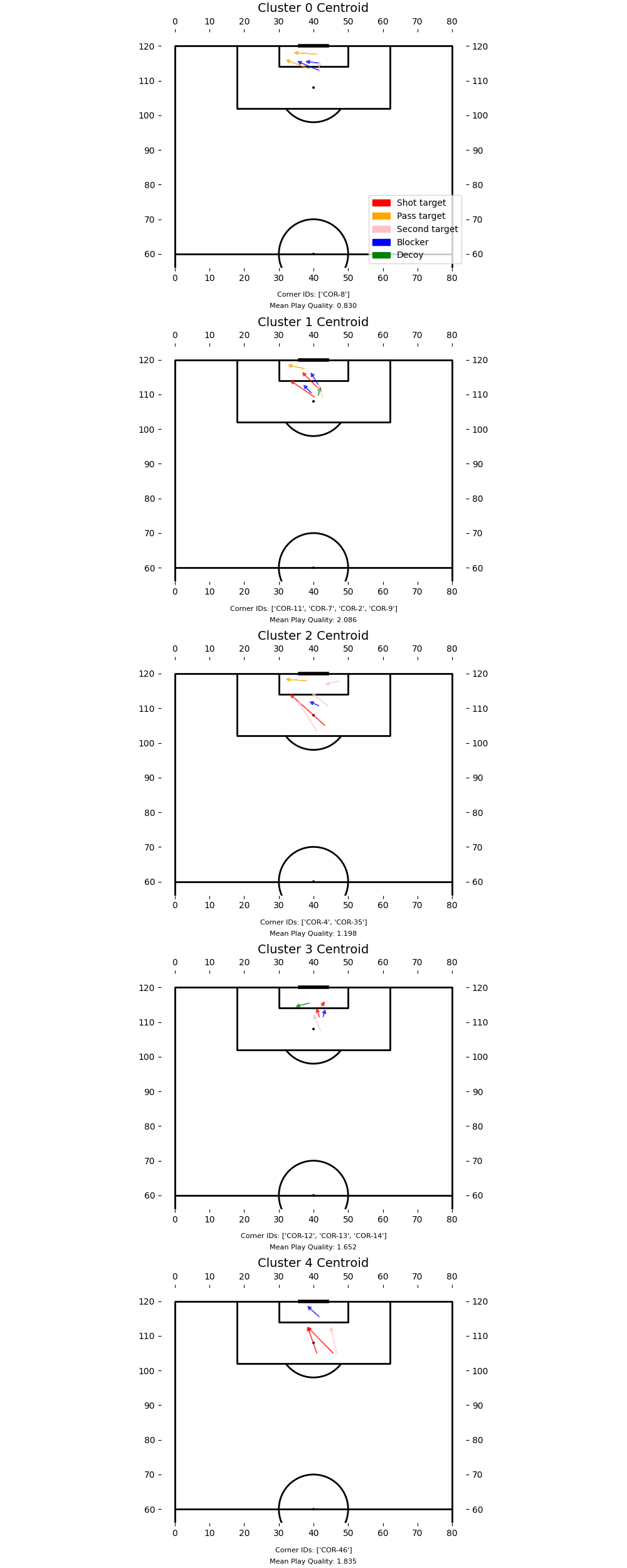
It was okay, and managed to get clusters that could make sense if you thought about it long and hard, but ultimately it suffered a bit from a lack of interpretability and control over the clustering process. You can see for yourself if the "average" plays for each cluster make sense, because some do, but most don't:
Similarity score + spectral clustering
The other method I tried, and the method I’m a bit more optimistic about, is defining a similarity scoring system for corners. Corners would have a higher similarity score if equivalent roles had similar start and end positions, while the score would be penalised if there were big differences in the availability of roles. The benefit here is that we can leverage a bit more domain knowledge to give importance to things that we know to matter at corners, and it’s a bit easier to explain why corners ended up in the same cluster:
CLUSTER 0 (4 corners)
----------------------------------------
Corner IDs: COR-2, COR-9, COR-11, COR-31

Key similarities:
• Shot target players (7 total):
    - Start positions: (41.4, 109.3) - highly consistent
    - End positions: (36.9, 115.1)
• Pass target players (4 total):
    - Start positions: (39.2, 115.5) - highly consistent
    - End positions: (36.7, 117.8)
Once we have a similarity matrix (i.e. the similarity score for every combination of pairs of corners), then we can use spectral clustering to find the clusters.
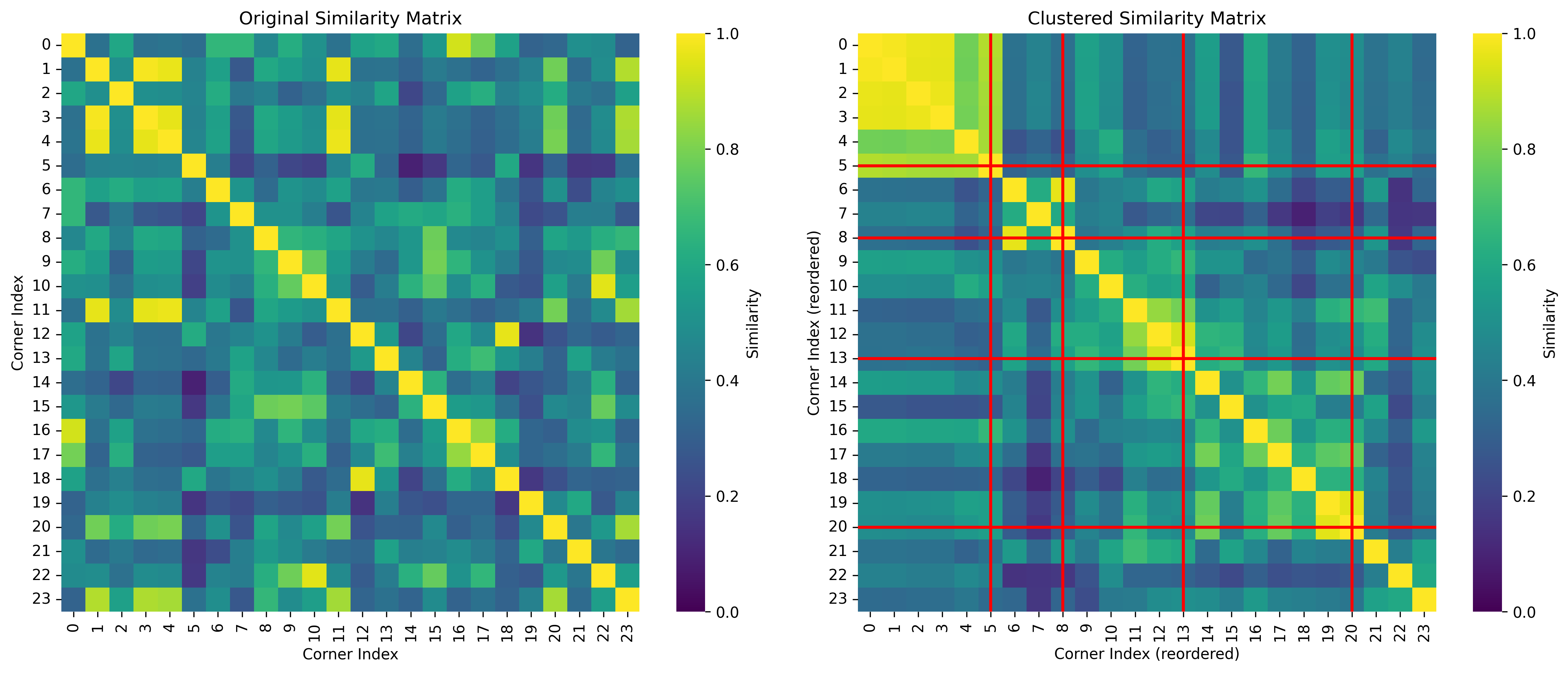
Ultimately for the article, I ended up grouping the corners by hand after looking over their play diagrams, but I'd like to get the similarity-based clustering to a point where it’s giving me sensible clusters, even if they are the same ones that I come up with, because then that becomes a very useful scouting tool.
Reflections and tidbits
- Interpretability is still a huge requirement of mine for any metric or analysis method, and I'd really welcome any feedback on the metrics I've put forward here, especially if you have a coaching background. As much as the world has become so data-driven these days, sports analysis is one of the few places where everything we do ties directly back to something physical in real life. If you can't relate a metric to real life scenarios and make real life recommendations from it, it’s not ready.
- For the data scientists and engineers, here is the GitHub repo: https://github.com/gsheir/arsenal-corners
- This took 5 evenings (6 if you count the long walk I spent deciding how I wanted to do this). It’s been great fun. There will be more.